


 Sat Mar 23, 2024 11:33 pm by globalturbo
The Medicare records clearly show the vaccines are killing people

Steve Kirsch
Executive summary
Every state has both death and vax status databases. A simple merge of the two tables (using name, SSID, DOB, sex, etc) tells us, for each person who died, how many days elapsed from each vaccine dose. When you plot this for the Medicare data, it’s “supposed” to be dose independent because the vaccine is “supposed” to have no impact on mortality. It should be just the background death rate perhaps with the COVID deaths flattened if it works as advertised.
The reality is that the curves are not horizontally shifted versions of each other. That means the intervention had an unintended all-cause mortality effect when COVID wasn’t present (i.e., to kill people).
This is why they aren’t showing us the raw data.
Because they don’t want anyone to know the truth.
Introduction
Since the vaccines aren’t given randomly over time, but are concentrated in certain quarters, the easiest way to analyze the days till death results is to restrict the sample to those people who got vax #N in a specific range of time.
The results
This means the vaccines are not saving lives. They are killing people.
The reference data: the key to understanding the Medicare curves
In order for you to understand what is going on, you first need to understand what to expect.
That’s really simple. If the shot is given in Q1 of 2021, the death curve after the shot should look like the background death curve since the shots are perfectly safe. They shouldn’t kill you.
There are 3 possibilities here:
We don’t consider the possibility that the shots lower all-cause mortality since there is no plausible mechanism of action for that, nobody has claimed it, none of the clinical trials showed a measurable decrease in ACM, and the funeral business increased after the shots as well as the % of people dying with odd clots.
So here are the reference curves…
Baseline reference: Here’s 2015-2019 for 64 and older data from the CDC website; it peaks at an annual average of 92K people per week and the mid-year trough (weeks 22 - 38) is around 73K people/week):
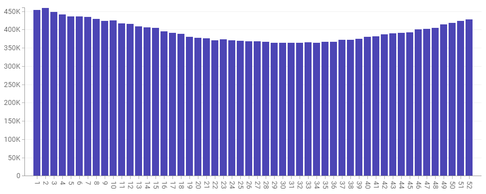
5 years 2015-2019 weekly death in the US for those 65 and older from CDC data. Screenshot taken from the CDC website.
Here’s the same data for the US, but only for 2020. The extra peaks can be reasonably attributed to COVID (but mostly to our horrible hospital treatment protocols (instead of advising early treatments developed by many independent physicians at the time). That’s because there was no vaccine at the time so nobody could die from the shot since it wasn’t available. Note we didn’t see the normal decline in January… the rates stayed elevated.
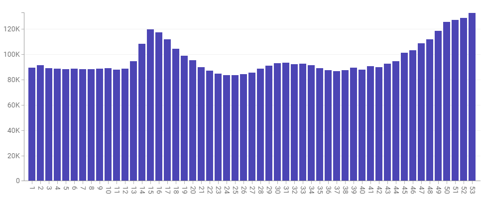
2020 deaths by week 65 and older
2021 reference: For 2021 we’re coming off a huge peak in Jan, but we never see the lows we should be seeing. And there is a big hump in Q3 which starts around week 30 (July 28) and ends around week 41 (Oct 14). Is the bump COVID? Or vaccine deaths? Or a combo? One thing is for sure; two-thirds of the country had at least one dose by that time, so if the vaccine really worked, we’d expect to see at most a 10K COVID death spike.
2021: Weekly deaths vs. week number for 65 and older. If the vax does nothing the shots should have a profile look like a shifted version of this (depending on when the shot was given)
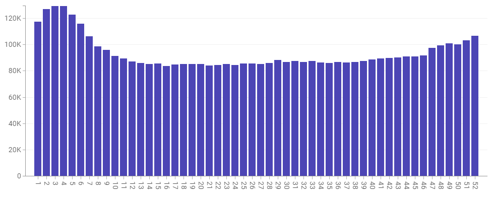
And just to prove that the CDC data for those 65 and over matches the Medicare data, here’s the data from Medicare:
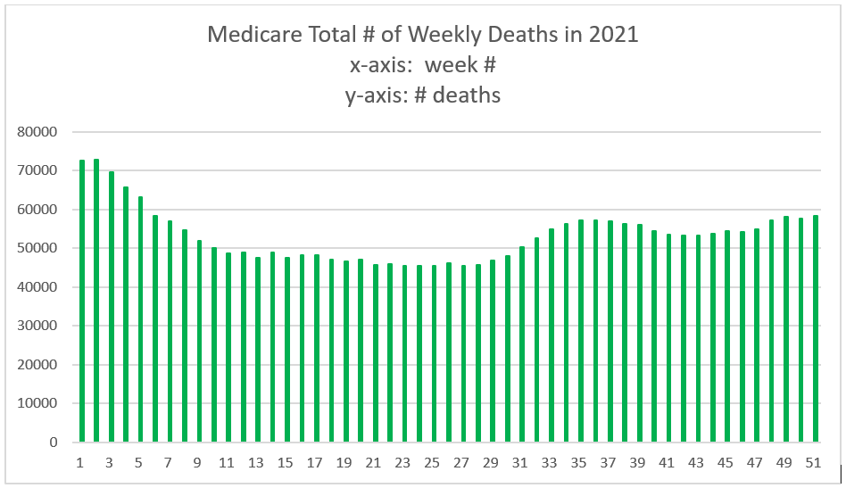
This is directly pulled from Medicare for 2021. Note that it matches our CDC graph for those 65 and older. This is totally expected.
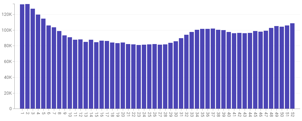
For 2022, we still aren’t back to normal as there was a huge spike in Q1 of 2022, but after that, things are looking more normal, but the trough is still elevated by around 10% overall from our 5-year reference which would be consistent with a large fraction of the population being vaccine injured and more likely to die. Note: No COVID spikes. Week 25 is 85,785 (2022) vs. 73,977 (5 year reference) which is a
2022: Weekly deaths vs. week number for 65 and older. The important thing here is that the flat portion here is comparable to the flat portion in 2021. So the dips in 2021 should be comparable to the dips in 2022. If they are lower in 2022, it means the shot killed people in 2021. If the dips are higher in 2022, it means the shots are killing people over the long term. Note that the 2022 peak is about the same height as it was in early 2021.
The Medicare data
This is Medicare data for those vaccinated during the quarter indicated and died. The graph x axis is how many days until they died from their vaccination date as specified (and not their “last” vaccination date which would give distorted results).
The easiest way to see what is going on is to look at the curves done by week where each person got a specific shot # in a specific week. Each curve should be just a “time shifted” version of the previous curve. So the Week 3 curve should look like the 3rd week onwards of the Week 1 curve.
Here are all the curves, but they aren’t shifted versions of each other like they have to be if the shots are a non-event. That means the vaccine is impacting their mortality since that’s the only difference… it’s roughly the same pool of people in all the cohorts (65 and older Medicare patients). And it’s ONLY claimed to reduce the “bump” size in the 2021 data.
In short every single one of the graphs below should just be a horizontally shifted version of the others.
Here are just a few examples.
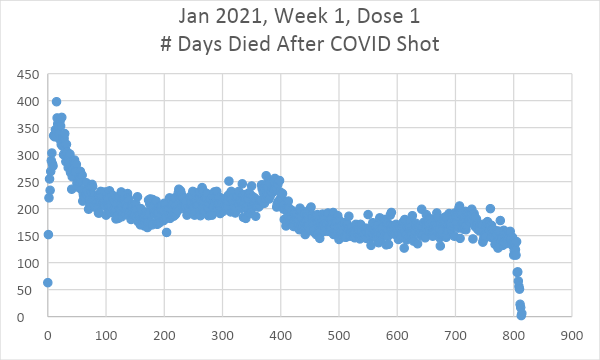
Figure 1. If you got your shot in week 1, the death days after the shot looks like a mustache with a droopy right side. What’s interesting here is that the slope is negative. But we saw from the underlying data that the Jan peaks were the same heights in Jan 2021 vs. Jan 2022. Here they are very different. Did the shot reduce your risk of dying in Dec 2021? Or are we seeking a huge peak in 2021 from the shot itself which is why the peek in Dec 2021 looks smaller?
Five weeks later the slope goes the other way and the first 100 days is
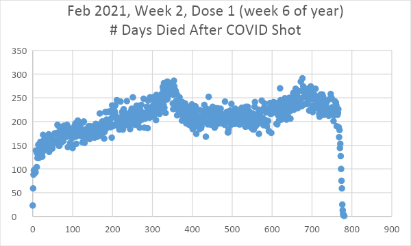
Figure 2. Shots given in week 6. This is a surprise! Our “mustache” is supposed to shift to the left and keep the same shape, but it has clearly tilted so now the left side is droopy. But this is supposed to be just Figure 1 left shifted by 35 days. But the slope has turned the other direction in just 5 weeks! And the seasonal peak at 350 days later is MUCH higher and sharper than if you got your shot 5 weeks ago. That peak includes COVID. So maybe our shots aren’t working after all to reduce COVID deaths because the slope is supposed to be flat!
Now let’s look at Shot 2 data:
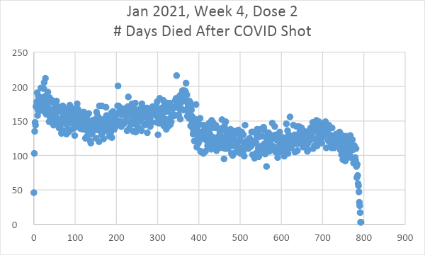
Fig 3. For Dose 2 at week 4 of 2021, he “mustache” droops on the right. The slope is NEGATIVE. Best explanation: it elevates your risk of dying in year 1.
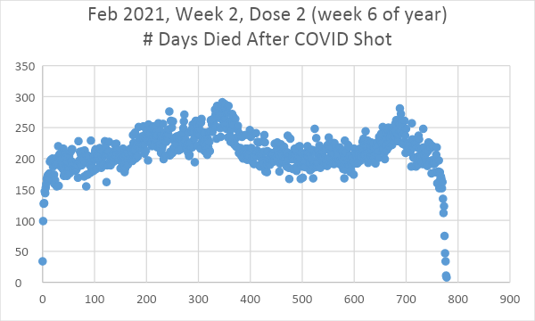
Figure 4. Just two weeks later, the slope is nearly flat. Dose dependency. Houston, we have a problem.
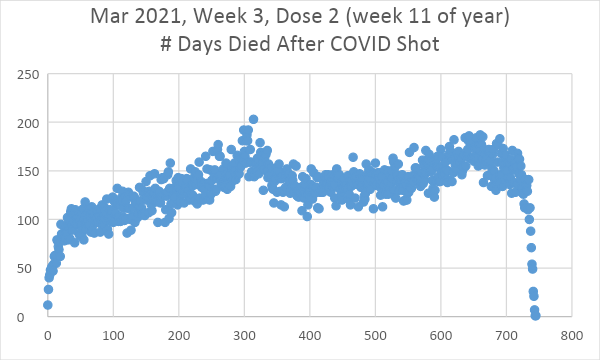
Figure 5. By week 11, the slope is very much upward. But this is a problem because all of these shots are supposed to be just shifted versions of each other; the shape and slope aren’t supposed to change. So now it appears you are more likely to die >1 year after the shot!
All the data
Summary
If the shots are safe and effective, they should be just left/right shifted versions of each other. I verified this is the case with the flu vaccine.
One could argue that the people who got shots first were the most vulnerable, but the prioritization was by age range only. But even if that is true, the shapes of the death curves should be identical and be related to external effects (like seasonality or a COVID wave). If the vulnerable got the shots earlier, it would just impact the height of their curve, not the shape.
Slopes changing like this is hard to explain: it means that the intervention made a difference. You can argue the intervention is supposed to make a difference and you’d be right: it is supposed to flatten the COVID death bump if you believe the narrative, but it is NOT supposed to change the overall slope of the curve because that is determined in the period where there is no COVID. It clearly does the latter.
How do you explain the fact that the slope is negative in the early shots and is positive in the later shots?
There is only one explanation that I’m aware of: the shots did not have the same contents over time.
Neither the vaccine manufacturers nor the CDC did any QA of the vials, so there is no way to disprove my hypothesis AFAIK.
In any case, changing slopes is a problem for the “safe and effective” narrative. The slope is supposed to be flat. So it appears that the doses given out at the start of the vaccination program tended to kill people at rates that declined over time whereas doses that were given later seem to kill people at rates that increased over time.
If anyone has a better explanation, I’m all ears.
Finally, if these shots were really safe and effective, the CDC would be publishing all the vax-death records from VSD, BEST, and Medicare to prove their point. It’s stunning that they go to great lengths to conceal the vaccination data of dead people, isn’t it?
THANKS TO: https://stevekirsch.substack.com/p/the-medicare-records-clearly-show?utm_source=post-email-title&publication_id=548354&post_id=112155284&isFreemail=true&utm_medium=email
The CDC could instantly make the death-vax records in Medicare public. But they won't. I'm going to show you why in this article in a way everyone can understand.
Steve Kirsch
Executive summary
Every state has both death and vax status databases. A simple merge of the two tables (using name, SSID, DOB, sex, etc) tells us, for each person who died, how many days elapsed from each vaccine dose. When you plot this for the Medicare data, it’s “supposed” to be dose independent because the vaccine is “supposed” to have no impact on mortality. It should be just the background death rate perhaps with the COVID deaths flattened if it works as advertised.The reality is that the curves are not horizontally shifted versions of each other. That means the intervention had an unintended all-cause mortality effect when COVID wasn’t present (i.e., to kill people).
This is why they aren’t showing us the raw data.
Because they don’t want anyone to know the truth.
Introduction
Since the vaccines aren’t given randomly over time, but are concentrated in certain quarters, the easiest way to analyze the days till death results is to restrict the sample to those people who got vax #N in a specific range of time.The results
- The curves were dose dependent (shape varied based on dose number)
- The curves didn’t match either the baseline reference or the 2021 reference.
- The curves don’t even match themselves; with one week qualifying windows, the curves should just be horizontally “shifted” versions of each other (easiest is to line up the drop off at the end when comparing).
This means the vaccines are not saving lives. They are killing people.
The reference data: the key to understanding the Medicare curves
In order for you to understand what is going on, you first need to understand what to expect.That’s really simple. If the shot is given in Q1 of 2021, the death curve after the shot should look like the background death curve since the shots are perfectly safe. They shouldn’t kill you.
There are 3 possibilities here:
- If the shots significantly reduce the risk of COVID deaths by a factor of 10X like the CDC claims, then the “deaths vs. days after shot” curve should look almost exactly like the “before COVID” death curve, i.e., the reference curve in 2015-20109. This is because everyone getting the shot now has the normal average risk profile for death. There will be no “humps” when COVID deaths are high.
- If the shots do nothing to reduce mortality, then the “deaths vs. days after shot” curve should look exactly like the overall underlying mortality curve for that year and each graph will be just a shifted version of the other graphs.
- If the shots kill people, then the “deaths vs. days after shot” curve will not fit either of the above cases (or anything in between).
We don’t consider the possibility that the shots lower all-cause mortality since there is no plausible mechanism of action for that, nobody has claimed it, none of the clinical trials showed a measurable decrease in ACM, and the funeral business increased after the shots as well as the % of people dying with odd clots.
So here are the reference curves…
Baseline reference: Here’s 2015-2019 for 64 and older data from the CDC website; it peaks at an annual average of 92K people per week and the mid-year trough (weeks 22 - 38) is around 73K people/week):
5 years 2015-2019 weekly death in the US for those 65 and older from CDC data. Screenshot taken from the CDC website.
Here’s the same data for the US, but only for 2020. The extra peaks can be reasonably attributed to COVID (but mostly to our horrible hospital treatment protocols (instead of advising early treatments developed by many independent physicians at the time). That’s because there was no vaccine at the time so nobody could die from the shot since it wasn’t available. Note we didn’t see the normal decline in January… the rates stayed elevated.
2020 deaths by week 65 and older
2021 reference: For 2021 we’re coming off a huge peak in Jan, but we never see the lows we should be seeing. And there is a big hump in Q3 which starts around week 30 (July 28) and ends around week 41 (Oct 14). Is the bump COVID? Or vaccine deaths? Or a combo? One thing is for sure; two-thirds of the country had at least one dose by that time, so if the vaccine really worked, we’d expect to see at most a 10K COVID death spike.
2021: Weekly deaths vs. week number for 65 and older. If the vax does nothing the shots should have a profile look like a shifted version of this (depending on when the shot was given)
And just to prove that the CDC data for those 65 and over matches the Medicare data, here’s the data from Medicare:
This is directly pulled from Medicare for 2021. Note that it matches our CDC graph for those 65 and older. This is totally expected.
For 2022, we still aren’t back to normal as there was a huge spike in Q1 of 2022, but after that, things are looking more normal, but the trough is still elevated by around 10% overall from our 5-year reference which would be consistent with a large fraction of the population being vaccine injured and more likely to die. Note: No COVID spikes. Week 25 is 85,785 (2022) vs. 73,977 (5 year reference) which is a
2022: Weekly deaths vs. week number for 65 and older. The important thing here is that the flat portion here is comparable to the flat portion in 2021. So the dips in 2021 should be comparable to the dips in 2022. If they are lower in 2022, it means the shot killed people in 2021. If the dips are higher in 2022, it means the shots are killing people over the long term. Note that the 2022 peak is about the same height as it was in early 2021.
The Medicare data
This is Medicare data for those vaccinated during the quarter indicated and died. The graph x axis is how many days until they died from their vaccination date as specified (and not their “last” vaccination date which would give distorted results).The easiest way to see what is going on is to look at the curves done by week where each person got a specific shot # in a specific week. Each curve should be just a “time shifted” version of the previous curve. So the Week 3 curve should look like the 3rd week onwards of the Week 1 curve.
Here are all the curves, but they aren’t shifted versions of each other like they have to be if the shots are a non-event. That means the vaccine is impacting their mortality since that’s the only difference… it’s roughly the same pool of people in all the cohorts (65 and older Medicare patients). And it’s ONLY claimed to reduce the “bump” size in the 2021 data.
In short every single one of the graphs below should just be a horizontally shifted version of the others.
Here are just a few examples.
Figure 1. If you got your shot in week 1, the death days after the shot looks like a mustache with a droopy right side. What’s interesting here is that the slope is negative. But we saw from the underlying data that the Jan peaks were the same heights in Jan 2021 vs. Jan 2022. Here they are very different. Did the shot reduce your risk of dying in Dec 2021? Or are we seeking a huge peak in 2021 from the shot itself which is why the peek in Dec 2021 looks smaller?
Five weeks later the slope goes the other way and the first 100 days is
Figure 2. Shots given in week 6. This is a surprise! Our “mustache” is supposed to shift to the left and keep the same shape, but it has clearly tilted so now the left side is droopy. But this is supposed to be just Figure 1 left shifted by 35 days. But the slope has turned the other direction in just 5 weeks! And the seasonal peak at 350 days later is MUCH higher and sharper than if you got your shot 5 weeks ago. That peak includes COVID. So maybe our shots aren’t working after all to reduce COVID deaths because the slope is supposed to be flat!
Now let’s look at Shot 2 data:
Fig 3. For Dose 2 at week 4 of 2021, he “mustache” droops on the right. The slope is NEGATIVE. Best explanation: it elevates your risk of dying in year 1.
Figure 4. Just two weeks later, the slope is nearly flat. Dose dependency. Houston, we have a problem.
Figure 5. By week 11, the slope is very much upward. But this is a problem because all of these shots are supposed to be just shifted versions of each other; the shape and slope aren’t supposed to change. So now it appears you are more likely to die >1 year after the shot!
All the data
- Dose 1 graphs
- Dose 2 graphs
Summary
If the shots are safe and effective, they should be just left/right shifted versions of each other. I verified this is the case with the flu vaccine.One could argue that the people who got shots first were the most vulnerable, but the prioritization was by age range only. But even if that is true, the shapes of the death curves should be identical and be related to external effects (like seasonality or a COVID wave). If the vulnerable got the shots earlier, it would just impact the height of their curve, not the shape.
Slopes changing like this is hard to explain: it means that the intervention made a difference. You can argue the intervention is supposed to make a difference and you’d be right: it is supposed to flatten the COVID death bump if you believe the narrative, but it is NOT supposed to change the overall slope of the curve because that is determined in the period where there is no COVID. It clearly does the latter.
How do you explain the fact that the slope is negative in the early shots and is positive in the later shots?
There is only one explanation that I’m aware of: the shots did not have the same contents over time.
Neither the vaccine manufacturers nor the CDC did any QA of the vials, so there is no way to disprove my hypothesis AFAIK.
In any case, changing slopes is a problem for the “safe and effective” narrative. The slope is supposed to be flat. So it appears that the doses given out at the start of the vaccination program tended to kill people at rates that declined over time whereas doses that were given later seem to kill people at rates that increased over time.
If anyone has a better explanation, I’m all ears.
Finally, if these shots were really safe and effective, the CDC would be publishing all the vax-death records from VSD, BEST, and Medicare to prove their point. It’s stunning that they go to great lengths to conceal the vaccination data of dead people, isn’t it?
THANKS TO: https://stevekirsch.substack.com/p/the-medicare-records-clearly-show?utm_source=post-email-title&publication_id=548354&post_id=112155284&isFreemail=true&utm_medium=email